Client overview

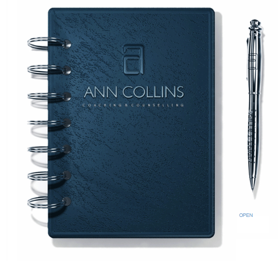
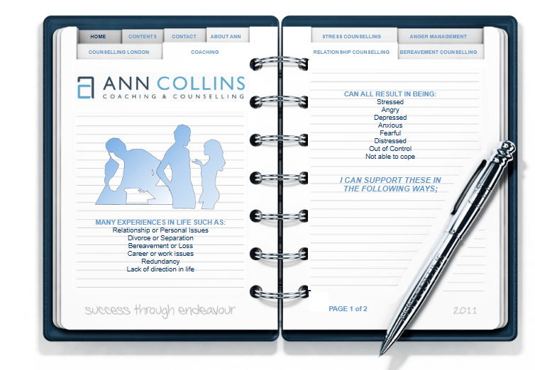
Dr Ann Collins needed a new website that reflected where her practice had moved to professionally, especially after completing her doctorate. The previous website, created in 2011, had a memorable journal-style interface, but the experience no longer matched how people expect to browse, read and contact a professional service online.
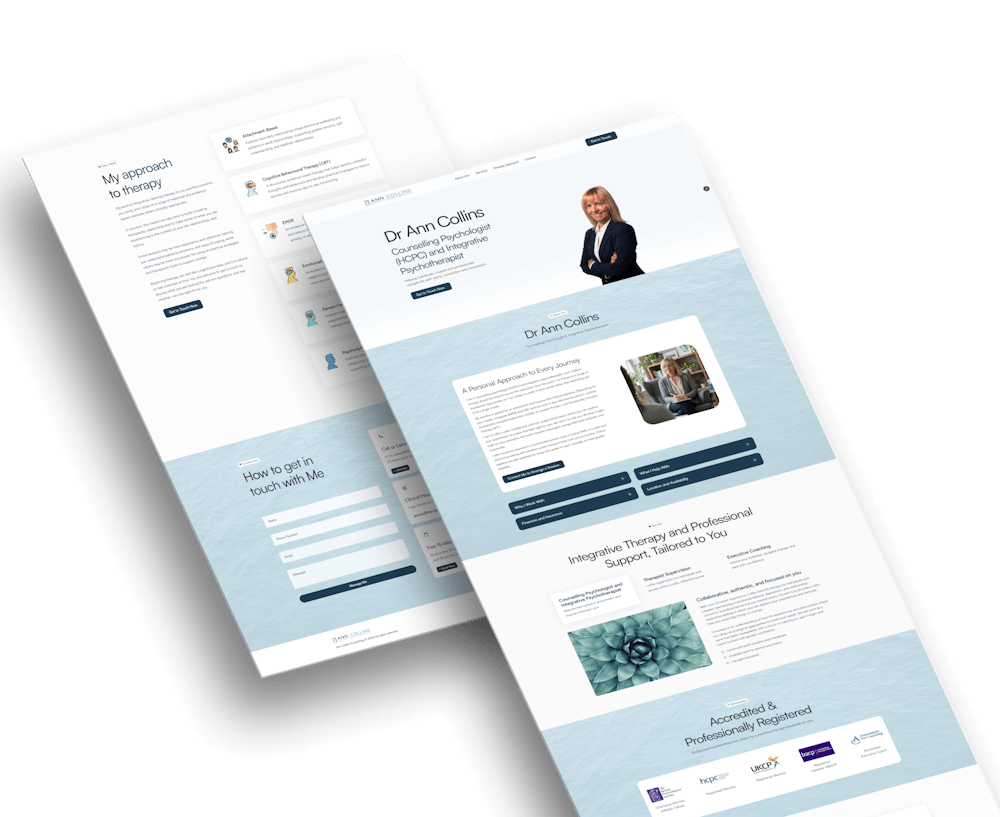
The redesign focused on creating a calm, credible and approachable one-page website that made Ann’s services, therapeutic approach, contact details and professional registrations easy to find without overwhelming the user.
UX/UI process
The project started with a clear UX goal: make it easier for visitors to understand who Ann is, how she works, who she supports, and how to get in touch. The design needed to feel professional and reassuring, while still keeping Ann’s own voice and warmth at the centre of the page.
Reviewing the old experience
The 2011 website had a creative journal-style concept, with navigation built around bookmark tabs. It had personality, but the interaction pattern was no longer as clear or responsive as users expect today.
Shaping the content
Ann provided her own wording, which helped keep the site honest and personal. My role was to structure that content so users could scan the page, understand the services, and find the right information quickly.
Designing for clarity
The site needed to cover psychotherapy, therapist supervision, executive coaching, accreditations and contact details in one page. I used sections, tabs, accordions and clear calls to action to keep the experience light and manageable.
This created a page that feels calm and easy to move through, while still giving enough depth for visitors who want to understand Ann’s approach before making contact.
What I designed
The final website was built in Framer as a responsive one-page experience. The focus was on simple navigation, calm visual design, readable content and a structure that helps users build trust as they move down the page.
A clearer one-page journey
The page moves from introduction, to Ann’s background, to services, accreditations, therapy approach and contact. Each section answers a natural user question.
Responsive Framer build
This was my first Framer website, so a lot of the build involved learning how to manage layout, breakpoints and responsive behaviour while keeping the design polished across devices.
Scannable service content
Tabs and accordions were used to present Ann’s different areas of work without making the page feel too dense. This helped keep the experience simple while still covering a broad skillset.
A calm and credible UI
Soft colours, generous spacing, water imagery and professional photography were used to create a design that feels approachable, trustworthy and appropriate for a therapy setting.
The result is a website that feels more current, easier to use and more aligned with Ann’s professional identity, while still allowing her personality and own words to come through.
Results
2011 -> 2026
A creative older website was reworked into a clearer, responsive digital presence
1 page
All key information is available in one simple, guided page.
Responsive
Designed and built to work across desktop, tablet and mobile.
The redesign gives Ann a professional and approachable website that is easier to navigate, easier to read and better suited to how users browse today. It also gave me a valuable opportunity to build in Framer while applying UX decisions around content structure, hierarchy and responsive design.