Client overview

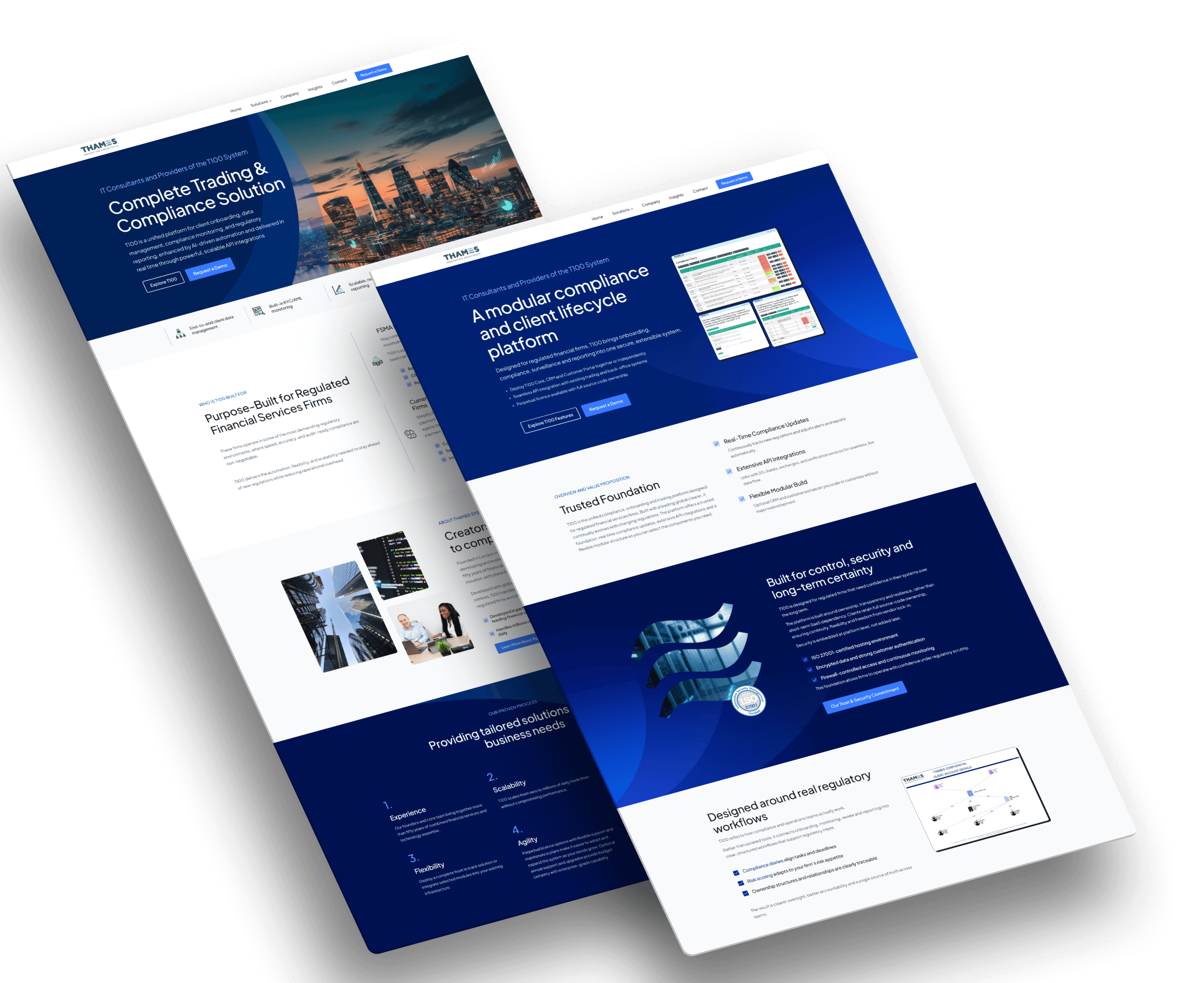
Thames Systems provides client lifecycle management software for derivatives firms, with teams across the UK and US. The redesign focused on giving the company a more current, high-authority online presence while keeping the experience light, clear, and easy to navigate.
The company had a strong product and deep industry knowledge, so the design also needed to bring more of that authority and personality through.
The project included UX planning, competitor research, sitemap structure, UI design, content planning, a dedicated demo journey, blog setup, and filming and producing a series of product and company videos.
UX approach
The main UX challenge was to make a specialist financial product easier to understand without oversimplifying it. The site needed to work for busy C-suite visitors, so the structure, content, and visuals had to be clear at a glance.
Understanding the company
I spent time getting to grips with what Thames Systems does, who the software is for, and what C-suite visitors would need to know before booking a demo.
Looking at competitors
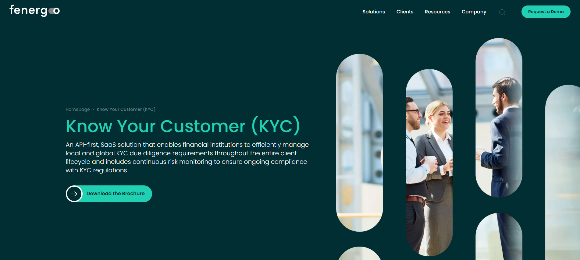
I looked at companies such as Fenergo and ComplyAdvantage to understand common patterns in financial software websites.
Mapping the content
The sitemap was expanded so key areas of the product had room to be explained properly.
This helped shape the direction for the new site: more useful pages, clearer navigation, a lighter visual style, and a better balance between authority and approachability.
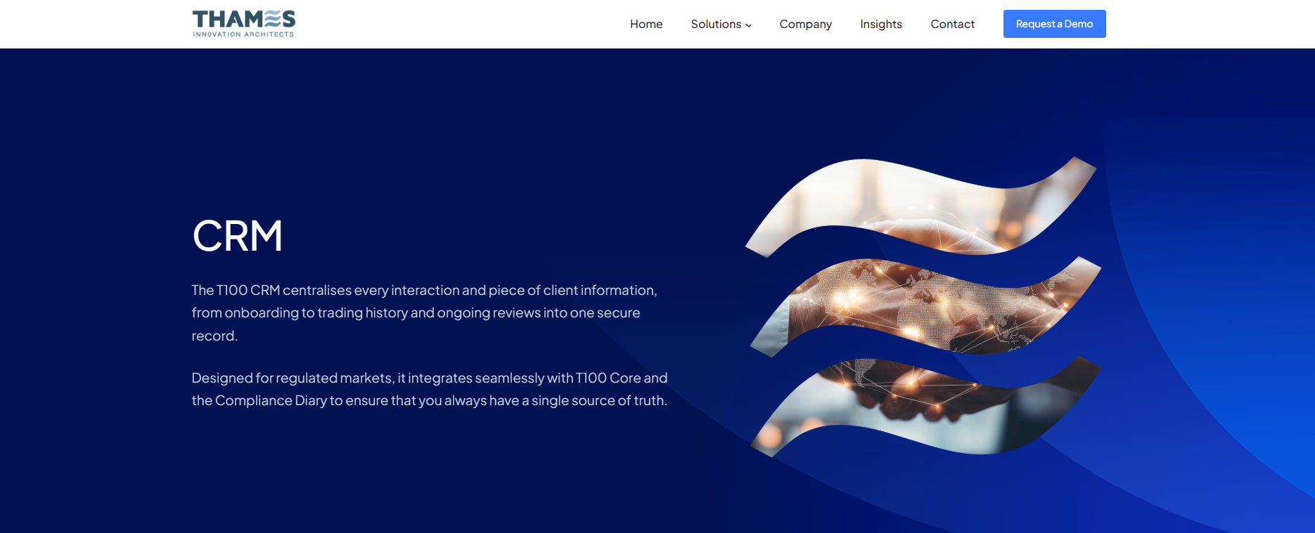
I used Thames Systems’ existing identity more confidently, including subtle inspiration from the “E” in the Thames logo for header styling. This helped the site feel more distinctive without making the design feel too busy.
Challenge
Thames Systems had a detailed product, experienced people, and a strong position in a specialist market. The website needed to bring more of that through.
The brief was to create a clearer structure, explain the software in more depth, improve the demo journey, and give the brand a more polished digital presence.
• Make the software easier to understand for senior financial users.
• Some elements appeared clickable but were not, creating confusion.
• The company’s size and expansion across the UK and US was not coming through strongly enough.
• The design felt dated compared with competitors in the financial technology space.
The bigger challenge was taking a lot of specialist information and turning it into a website that felt easy to scan, useful, and still high authority.
What I worked on
The redesign combined UX structure, UI design, content planning, and ongoing website support. The aim was not just to refresh the look of the site, but to make it more useful as a product, sales, and content platform.
Sitemap and structure
I helped break the site into clearer sections so visitors could explore the software, company, modules, blog, and demo route more easily.
Product module pages
The software was structured around its three main modules: CRM, Core, and Customer Portal. Each area was given space to explain what it does.
UI and visual direction
The interface was designed to feel clean, current, and high-authority, with enough whitespace and hierarchy to keep the content easy to scan.
Video and blog content
The site has been designed to support upcoming professional video content, planned for summer 2026, covering the software, company, regulatory change, and AI developments.
The result is a site that gives Thames Systems more room to communicate clearly, while still feeling simple to move through.
Results
50+ years
Industry experience. The design needed to reflect the company’s depth of financial knowledge and authority.
+20
New pages created, and content for all of them. Including 3 new blog articles
3 Videos
Short videos are planned to support the site and explain the software in a more personal way.
The new site gives Thames Systems a clearer way to present its software, people, modules, articles, videos, and demo journey. It feels more current and polished, while keeping the experience readable for senior financial users.